Pumas
The most iconic team in México revamps its home's visual identity
Pumas is more than a mere football team. It represents Mexico’s National University (UNAM), and its home stadium (official name “Estadio Olímpico Universitario”) is located inside a site that has made the UNESCO World Heritage List for being “a unique example of 20th-century modernism”. In July 2023, Pumas decided to update its home turf experience with a new light show and a state-of-the-art new screen.
The main challenge was then to create visual assets that would honor a building that is adorned by the works of legendary Mexican painter Diego Rivera, and that Frank Lloyd Wright once called “the most important building in modern America”.
How could you reflect the strong personality of the club and at the same time conmemorate the historic significance of its stadium? Runente had a couple of ideas.
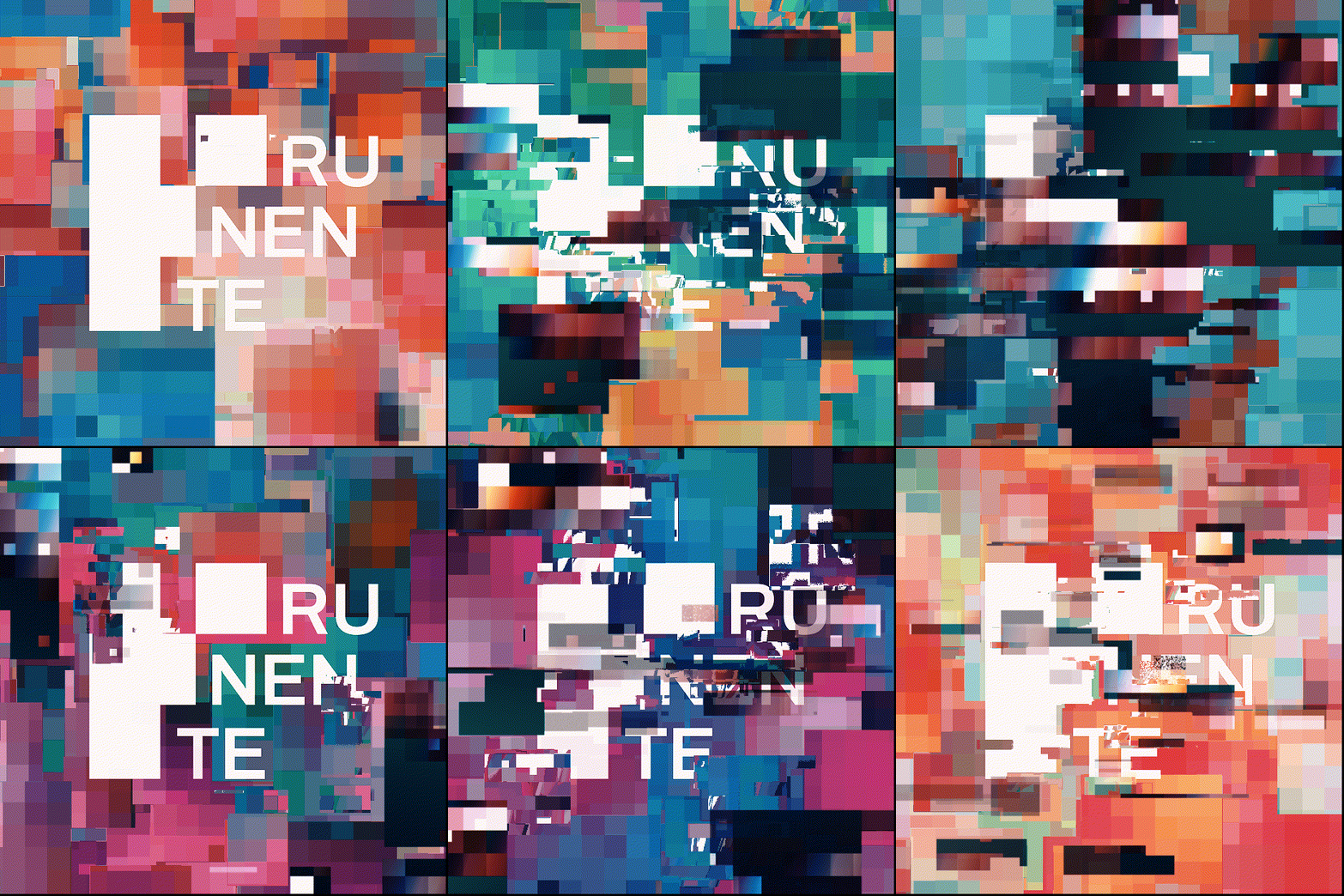
First concepts made in Midjourney.
The request
Runente first learned about the project in July, when the club’s front office was looking for potential animators who could pitch their vision for the new videos that would accompany the still-to-be-revealed new stadium screen.
“The participants were mostly bigger studios. We have a smaller creative core, but our previous projects helped Pumas see the potential we had. They gave us a reference video and told us their main goal was to institute a new era in match celebrations, something that grabs people’s attention and becomes a sort of tradition inside the stadium”, Rolando González, Creative Director at Runente.
The team started working on different possible juxtapositions that could potentially match Pumas’ initial prompt. These ideas were included in a presentation that reflected Runente’s vision of this new era, including some of the team’s most iconic lore.
The blueprint
The process of going from the first pitch to the approved product included a lot of input produced by artificial intelligence. The use of AI in visual media is growing, but the way in which Runente applied it might surprise you.
“We used ChatGPT to understand important things about the club. We didn’t use it as a source of truth, but as someone who knows which information to look into, so it’s more about the research paths than the answers themselves. We also used Midjourney and ControlNet in Stable Diffusion to prototype many of the ideas we had, choosing our palette and our ideas and using the tools to abstract it a little bit further. For us, AI tools are not a substitute for designers or animators, but a way to make proposals as if we were a bigger team, empowering them to iterate the tedious parts faster so they can focus on the creative side”, Rolando González, Creative director at Runente.
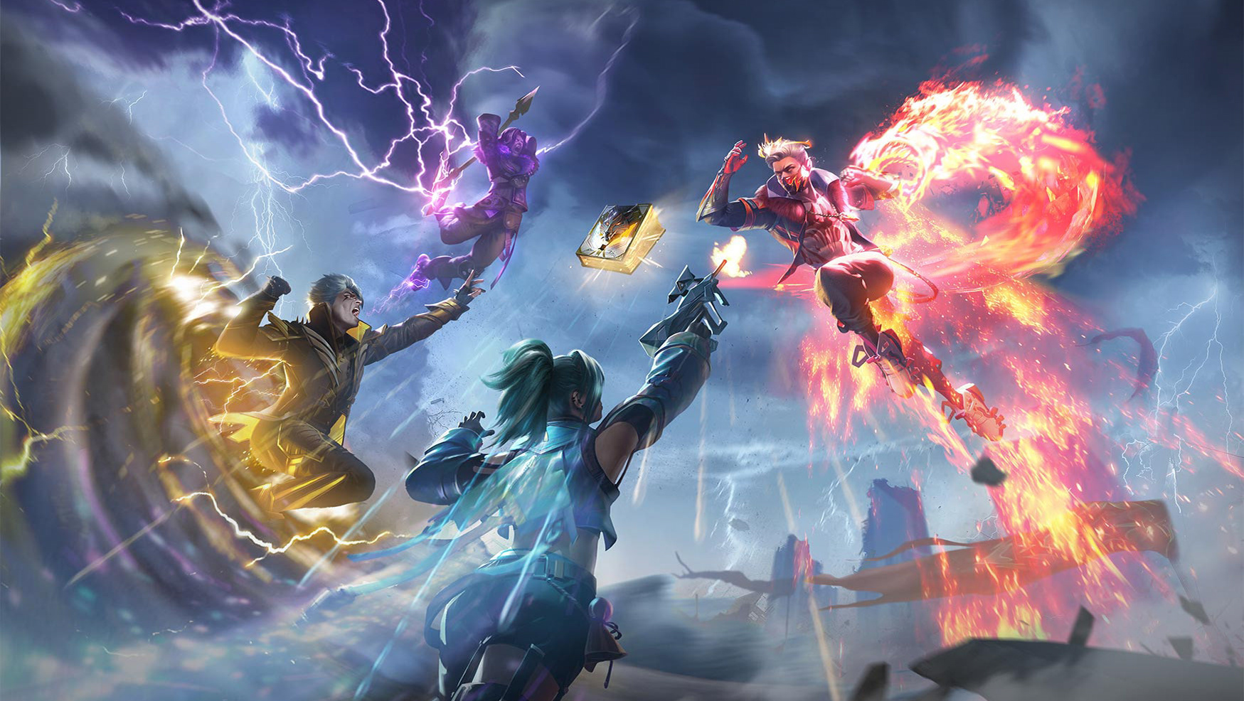
Styleframes made in Midjourney for the pitch.
The proposals were based on the timeframe available for the project’s delivery. Originally, artists, designers and animators were envisioning a 4 week timeframe, which in reality ended up being only 2 weeks.
The final idea encompassed three separate videos: one meant to be used as a welcome to match attendants, another one for goal celebrations, and one more for Pumas’ most traditional chant, called “Goya”.
The welcome video shows a defiant puma getting out of its den to roar at us before getting back in it. The den itself is formed by the volcanic stone present in the vicinity of the stadium and has details reminiscent of the University itself.
The Goya video follows closely the choreography conducted by the club’s mascot before every chant, a sight familiar to every Pumas fan. Finally, the goal video honors the power behind every scoring shot, mimicking a volcano explosion.
All three videos have a 3D effect that is dependent on perspective. This means that the team had to go to the stadium and take measurements in order to find the seats where the animations would look best. Our aim was for the show to be great for every attendee, but for a select few it will look out of this world (and out of the screen).
Just how invested is Pumas in this new era of its stadium? The club has already made arrangements to move some of its games from the traditional midday slot to 6pm, when fans will have the ideal conditions to enjoy the show.
Bumps on the road
When Runente’s team first saw the screen in person they realized that it wasn’t flat, as they had originally thought, but slightly curved, which meant that every video would have to be revisited and modified in order to achieve the intended experience.
“We had the intention of building everything in a very volumetric way, so we designed a system to modify the render to make it look right even if the screen is curved. We built a simulator in virtual reality using TouchDesigner with the actual measurements of the stadium. It’s funny that for one regular animation we had to use so much technology to guarantee optimum performance”, Rolando González, Creative Director at Runente.
3D Viz in Touchdesigner
What we learned and how it applies to future projects
AI doesn’t have to substitute people: Using the right prompts for the right tools we are able to turn every artist, animator, or designer into a “project manager” who oversees the visual assets created by AI. This helps us work in a smarter way and is a great tool for certain projects, but it doesn’t mean we stop needing humans for our creative positions.
Be nimble: the 3D effect caused Runente to make a decision surrounding how much forced perspective to involve in the final product. Through tests, we landed on a good balance that makes the end result available to as many seats as possible.
If you want to learn how Runente can help your business reach its digital goals contact us here.
